November Sky

“Some of the days in November carry the whole memory of summer as a fire opal carries the color of moon rise”. – G. Taber
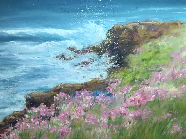
As large snowflakes cover the ground in winter, memories of beach days linger.  Even my recent pastel painting “November Sky” seems to be a distant vision.  I began the painting with an underpainting of pastel which I brushed down with 70% alcohol wash.  This allows me to build up several layers of pastel.  It is  always a challenge to render the patterns in the sand created by the waves, wind, and even footprints. I used a variety of pastels including Great American, Rembrandt, Terry Ludwig, Sennelier, and Unison brands. 

Postcard from Provence

Provence

“Postcard from Provence”, Linda Beach, pastel 11.5×15.5

The Red Valerian plants caught my attention as I looked out over the view from the ruins of the chateau at Chateauneuf-du Pape in Provence. This painting is my first of the new year and decade. When I observed this scene last spring, and saw the red shutters and the red or rose flowers of the foreground, I knew that I must paint the image. I like the contrast of red and green which are complimentary colors. The arrangement of tile roofs as they go off in the distance towards the Rhone River also added interest.

Artist notes:
Sennelier La Carte card with various pastels (Rembrandt, Sennelier, Terry Ludwig, Unison), and Conte pastel pencils.

By the Sea

EaselbytheSea

Easel at Mayo Beach for After Hopper in Wellfleet, MA

The Paint Out for  Addison Art Gallery’s “After Hopper” in Wellfleet, MA was last Saturday. The event celebrates the artist Edward Hopper and continues the tradition of plein air painting iconic images of Cape Cod. I chose Mayo Beach and the oil house behind what was once the Mayo’s Beach Lighthouse on Kendrick Avenue. The pink and white beach roses which surround the simple painted brick outbuilding were in full bloom. Artists had the morning to paint and then deliver the finished work to the Wellfleet Public Library for an afternoon reception. This is often called a Quick Draw at other plein air paint outs.

ThumbnailBytheSea

Thumbnail sketch for “By the Sea”

I planned my composition with a quick thumbnail sketch. With only a few hours to work from concept to completion, I thought the simple building that originally held the oil for the lighthouse would make for good painting that could feature the simple beauty of the Cape scene. The race against the clock is helpful to push me to capture the essence of the view and not get caught up in overworking a painting. I used the broken split rail fence that was surrounded by the roses as a directional element to draw the viewer into the focal point.

I finished the pastel, framed it, and delivered it to the Wellfleet library to be hung for the reception to be held from 4 to 6 pm.  Soon I was rewarded for my morning’s work, when a new collector chose “By the Sea” for a gift for his wife. I have memories of a beautiful day by the sea.

ByTheSea

“By the Sea”, pastel, 11×14, private collection

On the Coast

Sea Thrift

“Sea Thrift”, pastel, 8,5×11

I spent a week on the Oregon Coast at Depoe Bay watching the surf, eating seafood, and exploring the area with the Beach family. I began this pastel on the coast, but I finished this at home since I didn’t have many of sticks that I needed for the rocks. The motion of the surf on the cliff below was a constant source of entertainment. I also was attracted to the profusion  of Sea Thrift which was in bloom.  There were many other pastels used in this piece, but I have shown some of the assorted pastels and pastel pencils used.  To get the fine mist of the sea spray, I used a paste of pastel mixed with alcohol and applied it by flicking the bristles of the toothbrush.  The sanded paper was Wallis, 9×12 with a assortment of  pastels by Terry Ludwig, Unison , Rembrandt, Sennelier, and pastel pencils by Conte and Stabil0.

Pastels Sea Thrift

Pastels for Sea Thrift

\

Raise The Roof

The roof line on the right of the house in my painting, “Yellow House in the Vineyard” got a repair. In my last post the house appeared to be falling into the ground. I raised the roof line on the sun porch and tweaked the area of the vineyard that overlapped that house. This is the beauty of working in pastel which is a very forgiving medium. It was a simple fix that involved removing the initial marks with a soft bristle brush before applying strokes of pastel. Here is the original that needed to be adjusted. I think the painting above is an improvement.


Yellow House in Vineyard

"Yellow House in Vineyard", pastel 11x14

“Yellow House in Vineyard”, pastel 11×14


The yellow house in the vineyard caught me eye one day when I was out on my usual walking route. I returned with my painting gear of pastels and set up my easel at the edge of the vineyard last week. Soon, the growth on the grapevines will be pruned to stimulate the growth for the next season. I wanted to catch the vines at their wilder state despite the challenge of depicting the tangled vines. Of course, there is always room for artistic license.
On location in the vineyard

On location in the vineyard


Painting Notes: Some of the background was simplified, so the focus was on the main elements of the scene, the barn, house, and rows of vines. To avoid a tangent of the barn roof and distant hills which, I added some height to the hills. Otherwise, the plein air painting is an accurate interpretation of the scene.
Technical Notes: Pastels by Terry Ludwig, Rembrandt, Sennelier, Nu Pastel, and Conte Pastel Pencils on La Carte Sanded Paper.

Lake Tahoe Test

Lake Tahoe Test

Test Strip and Reference Photo for” Lake Tahoe Afterglow”

To plan my color palette for a new pastel painting,  I began testing colors of various pastel sticks on a strip of  Uart 400 sanded pastel paper. It seemed like a natural approach to interpret a narrow strip from the reference photo. Later, I realized that testing the exposure in a narrow strip was a method that I used in black and white darkroom photography many years ago. It also seemed to translate into planning a pastel painting.

The reference photo was captured on the north shore of Lake Tahoe one October evening just after the sun had slipped  behind the mountains. My challenge in this painting will be to capture the afterglow in the sky and the reflected color on the lake.  I plan to emphasize the landscape format using  non standard dimensions.  I will post more on the painting when it is complete.

 Technical Notes: Pastel brands – NuPastel, Rembrandt, Sennelier, Schminke, Terri Ludwig. Uart 400 Pastel Paper.


I Brake For Sheep

Sheep (detail), watercolor

Sheep (detail), watercolor

On the road to the iconic Mont- St.- Michel, the island monastery off the coast of Normandy , the traffic came to an abrupt halt while we were on a family trip a few years ago.  We got out of our rental car as we saw others exiting the tour buses.  To our surprise it was not a car accident, but a flock of muddy sheep strolling across the ridge of the causeway to the abundant grazing land on the far side.

The moment that I saw the image in the camera, I knew that it was to be a future painting.  I did a study for a more detailed watercolor on an 11x 15 sheet of Arches paper.  I can see that the composition would be improved if I raise the horizon to the top third of the paper.  Also, I plan to add more details to the foreground puddles of water.  The water could also be improved by saving the lighter values for highlights. The color and the mist didn’t photograph well, but will also be strengthened. The sheep which are the main focus, could also be improved with attention to the details of the legs and facial features. Additional sheep on the right will also be included in the final painting. Can you tell that I am fond of sheep?

Sheep at Mont-St.- Michel, watercolor, 11x15( study)

Sheep at Mont-St.- Michel, watercolor, 11×15,(study)

Why Are Barns Red?

"Old Barn in Spring", pastel, 11 x17

“Old Barn in Spring”, pastel, 11 x17

It is February already! It is the month of Valentine’s Day when we hope someone thinks of us with tokens of love, the color red and flowers. January found me busy with this painting, “Old Barn in Spring.” The focal point of the painting is the red barn. The color of the red barn made me wonder why barns are painted red. They have been called “architectural poppies” that contrast with green grass. According to Catherine Bauer of Colorado and others that have researched the topic, early settlers in America painted huge barns that symbolized great hopes and plans for life in the New World. Farmers began painting barns after the 1700’s with skimmed milk, lime, and red oxide. Linseed oil and often blood was also added to the mixture. Some farmers thought that red painted barns kept them warmer inside in winter.

Red is the color of Valentine hearts. It is also symbolic of a zest for life. In design it is used to attract attention. In this painting I think the solidity and timeless quality of the weathered barn contrasts with the fleeting nature of the delicate pink of the fruit tree in the foreground.

Technical elements of the painting: I first blocked in the scene from a reference photo with pastel and set the under painting with a wash of water. The original scene did not have the pathway and foreground fencing which I added as a compositional element to invite the viewer into the painting. There were several vanishing points due to the various hills which made for a few challenges.

I hope the month of February brings you more symbols of the color red!

Winter’s Gift

Kyle with Painting Kyle with Painting
“Deep Winter”, 18×24

It was the first time that I done a painting based on another’s photograph. But, it was a photo taken by Kyle, my son and I had his permission to do a pastel based on his photo reference of a winter stream near Lake Tahoe. The deep blue of the river contrasts with the deep white snow. If I remember his description, the freshly fallen snow was deep and the temperature was fairly warm for New Year’s week.
The completed painting was framed and packed for my son’s move to Colorado this summer. When we visited him last month, it was also good to visit the painting hanging in its new installation in his home in Boulder. Indeed, paintings and the artist can seem like old friends. Like friendships, the pastel and I had our struggles and came to new understandings. There are other paintings in the New Year ahead. It was great to visit Kyle and my gift to him.